- Surface Area
- Posts
- Below the Fold at the New York Times
Below the Fold at the New York Times
Ted Merz
April 15, 2026
Sponsored by
The best story about The New York Times this week didn’t appear in the paper.
In fact it wasn’t an article at all, but a web site created by a freelance journalist named Ted Alcorn.
Alcorn tapped into the paper’s public API to create a dashboard that provides some extraordinary insights.
The first was that over the past 25 years, the Times employed – at various times – a total of 26,000 reporters who wrote 1.5 billion words to produce 2.2 million articles.
You can use the dashboard to drill down to see which beats, topics and people have been covered the most and how that coverage has fluctuated.
A few examples of the kinds of things Alcorn cited that he noticed:
➡️Trump dominates headlines compared with everyone
➡️Maggie Haberman has the most bylines recently
➡️India has been undercovered on a per-capita basis
➡️China coverage peaked around 2014
➡️Iowa stories surge every four years
Political partisans will mine the site for ammunition to argue the paper of record is pro THIS or anti THAT.
But that debate misses larger truths unearthed counting the number of stories in so many ways over such a long time period.
That's because the volume provides a measure of attention largely independent of ideology. Whether a news story about Trump is positive or negative doesn’t change the fact it is about Trump. And the fact that a story was published about Trump reflects the interest in hm.
It’s not a perfect system, but at this scale, breath and consistency, there is probably no better public dataset to measure what is on everyone's mind.
What Alcorn built – whether he realized it or not – was effectively a better version of Google Trends.
Google Trends provides comparisons based on search but they don't give you the actual data. It's normalized so you get relative percentages and that limits the comparisons you can make.
The Times archive comes from a single institution with a mostly consistent editorial policy over 25 years. That makes apples to apples comparisons possible. It’s a clean cohort in a world where good data is hard to find.
It provides a useful signal for understanding how attention has shifted among countries, companies, or individuals.
Times reporters jumped on the site when it appeared, mostly to see where they ranked on the leader board. Times editors will likely use the tool to better understand how coverage has shifted.
Given its utility, it’s sort of insane that it took an outsider to build it.
But in an open API world, the best analytics often are built by people outside the wall.
Alcorn explained the difficulty of reconciling data: Categories shift and reporters change names. The same subject gets coded differently over time.
Some Times reporters flagged bugs and suggested features.
But so far the paper hasn’t commented on the project, which he cheekily called Below the Fold.
You don't need to be technical. Just informed.

Most AI newsletters are written for engineers. This one isn't.
The AI Report is read by 400,000+ executives, operators, and business leaders who want to know what's happening in AI — without wading through code, jargon, or hype.
Every weekday, we break down the AI stories that matter to your business: what's being deployed, what's actually working, and what it means for your team.
Free. 5 minutes. Straight to the point.
Join 400,000+ business leaders staying ahead of AI — without the technical overwhelm.
BRIEF OBSERVATIONS
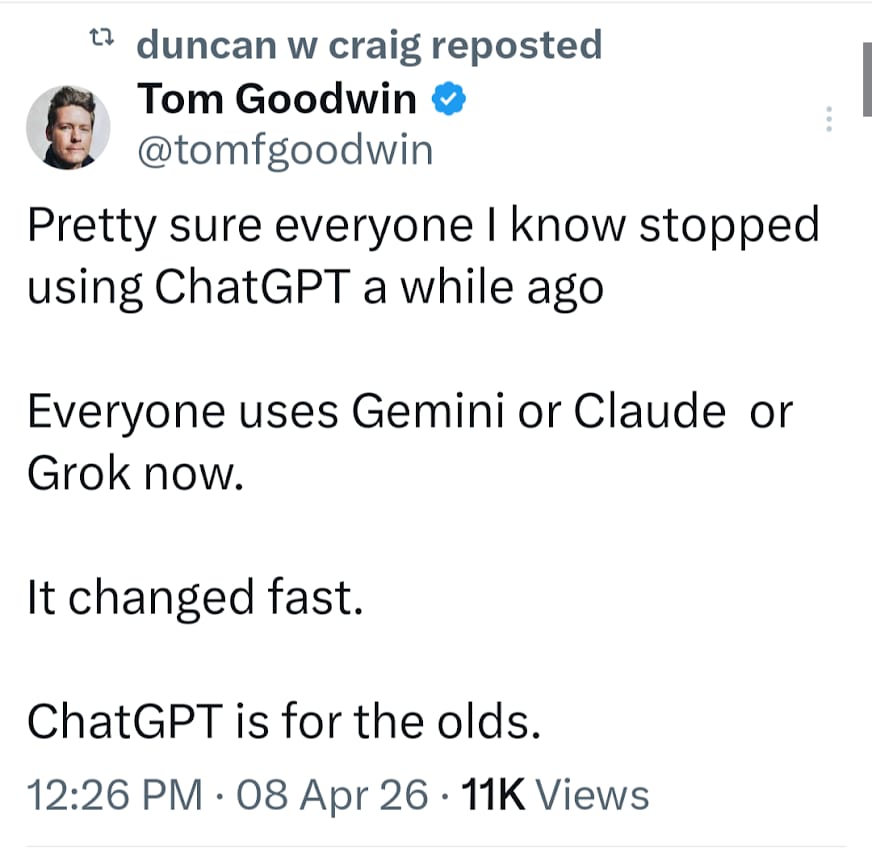
CLAUDE FOR THE WIN: This is broadly the consensus among everyone in tech that I speak with. The really remarkable thing Tom hits on is JUST HOW FAST it changed from OpenAI dominating the landscape. Life comes at you quickly.
THE 1 TRAIN: I never get tired of looking at old photos of New York in the 1980s to remind me about how much things have changed.

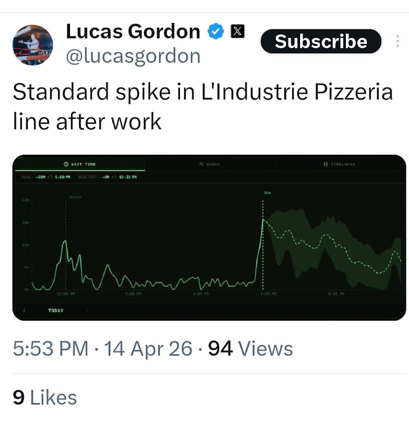
THE LINE AT L’INDUSTRIE: Lucas Gordon is an engineer at X (Twitter). He paid people who live across the street from hot downtown food places like L’Industrie Pizzeria to set up cameras to monitor the lines and then used AI image detection to calculate how long the line is at any point. So many cool things going on in tech.
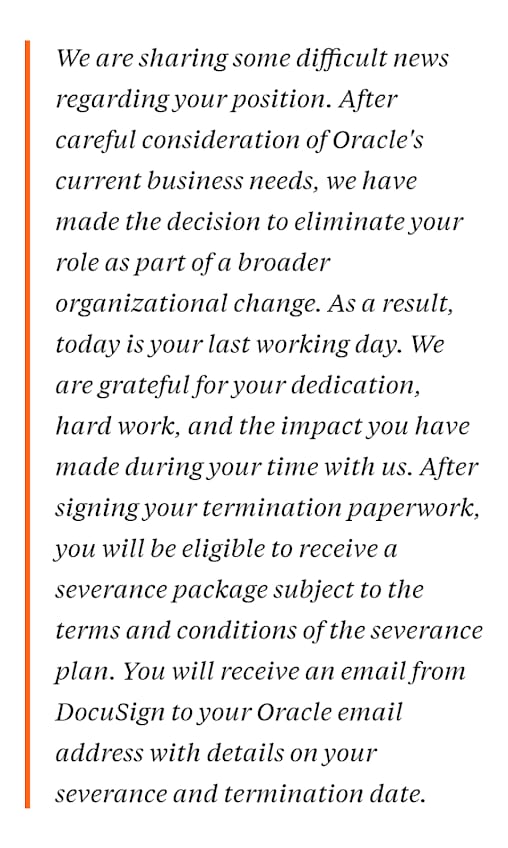
ORACLE LAYOFFS: This is the actual email Oracle sent to 30,000 people to let them go. It’s hard to imagine that as more and more people have this experience there won’t be some kind of fallout - whether its political or cultural or social. If this hasn’t happened to you, you may not understand. If it has, you do.
OR
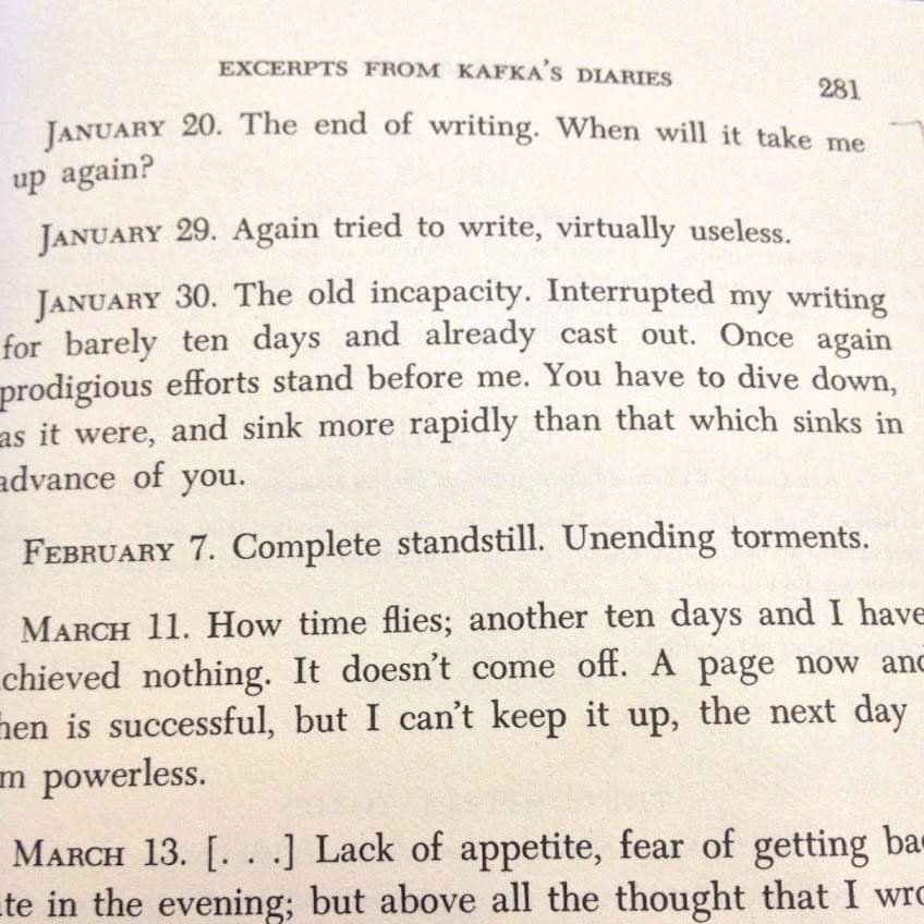
WRITERS BLOCK: If you are struggling to write you aren’t alone. Franz Kafka found himself “useless” on many days.
Please reach out if you have any thoughts about today’s newsletter. I enjoy hearing from readers. Send me a message if you want to talk or meet up if you are in NYC.
I would love it if you could share this newsletter with a friend.
Also, if you have a moment, take the poll below.
I read the New York Times |